Digital Temple
An interactive classroom designed for immersive learning
Overview
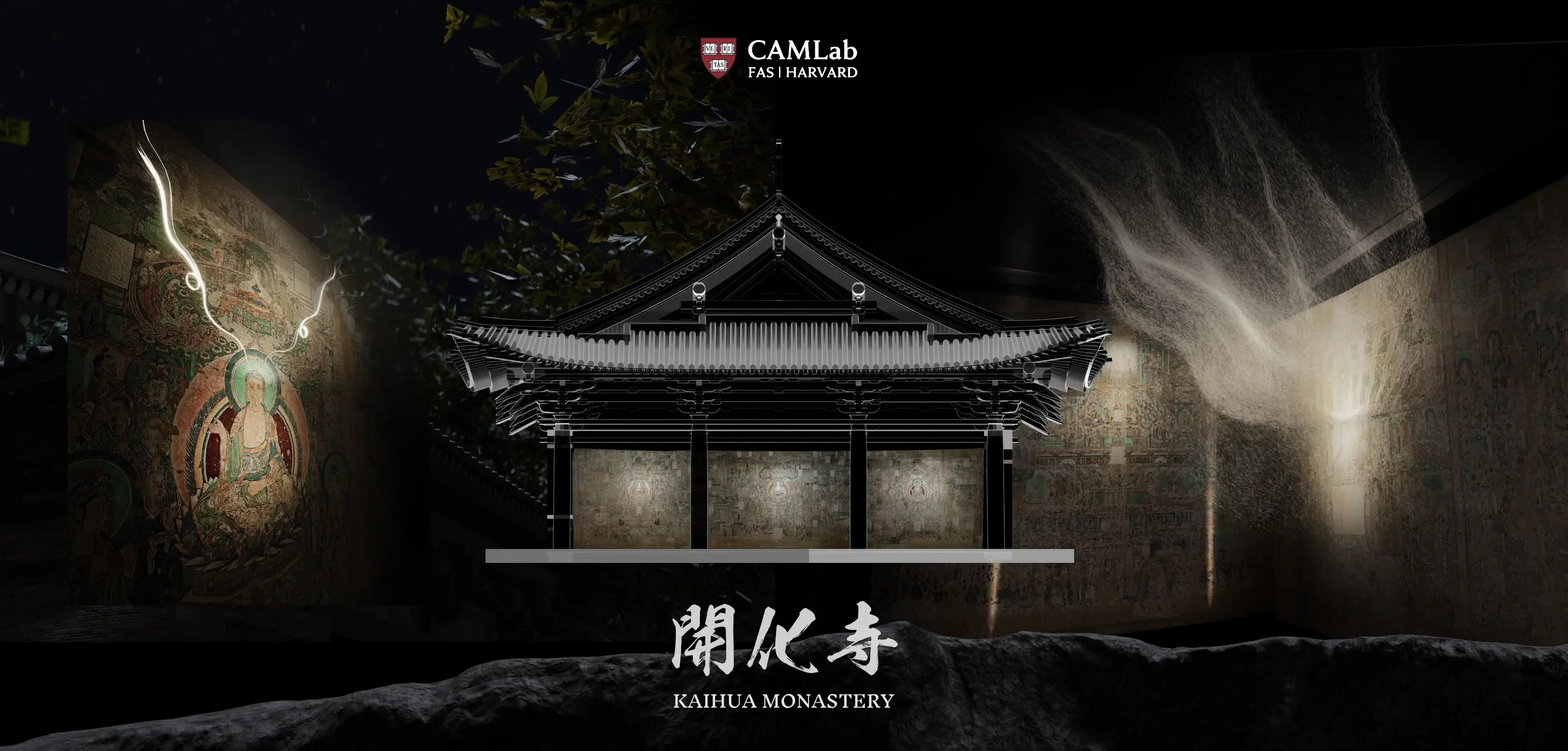
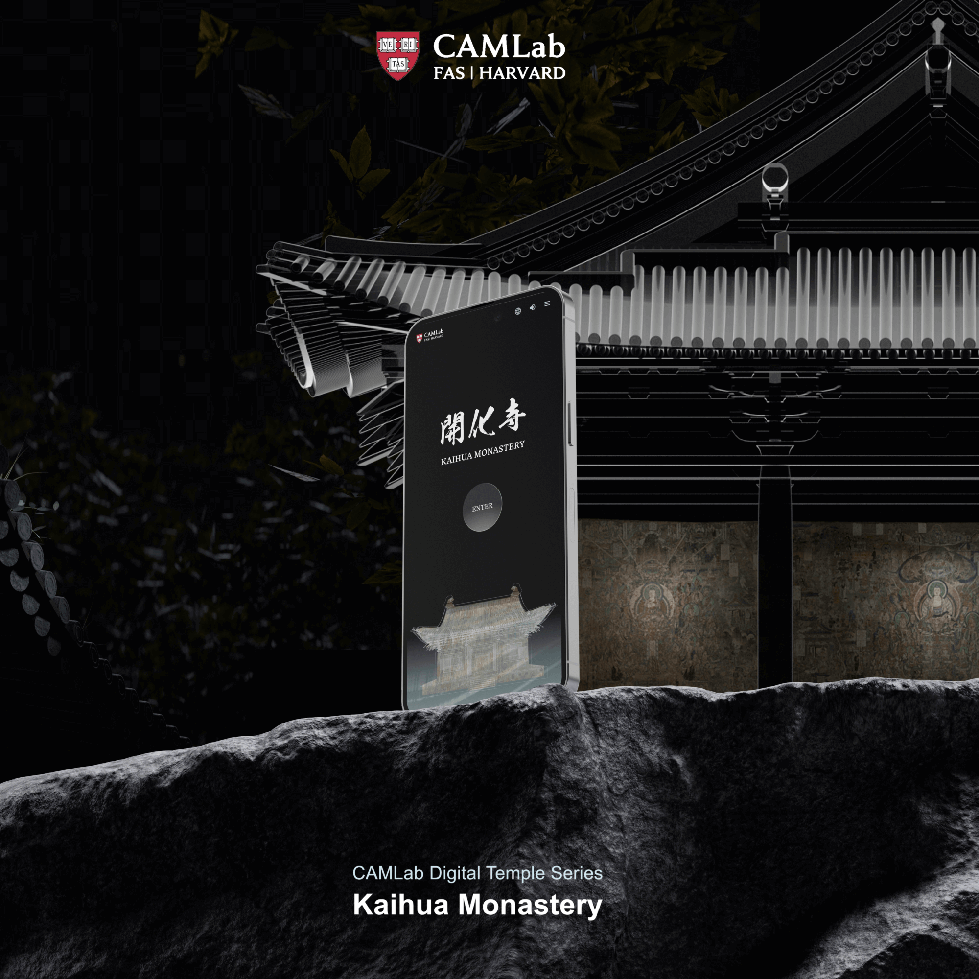
Digital Temple makes a difficult subject easier to learn. We turned Buddhist art and history from Kaihua Monastery into an interactive site with annotated images, a virtual gallery, 3D models, and simple games—showing how design can turn complex research into clear, enjoyable learning.
Organization
My Role
Product Designer, Project Manager
Project Site
Year
Jun 2022-Feb 2024

Do you know 85% of Buddhist temples worldwide are unprotected and not open to the public?
There is little to no digital data on Kaihua Monastery, and we can only learn about this remote heritage site from the research of few scholars.
User Research
10+
25
140+
We began with a simple goal: make knowledge more accessible. But soon we had to ask—who are our users, and what do they want to know? Through interviews, workshops with the Harvard Art History team, surveys, and journey mapping, we clarified user needs and learning goals.
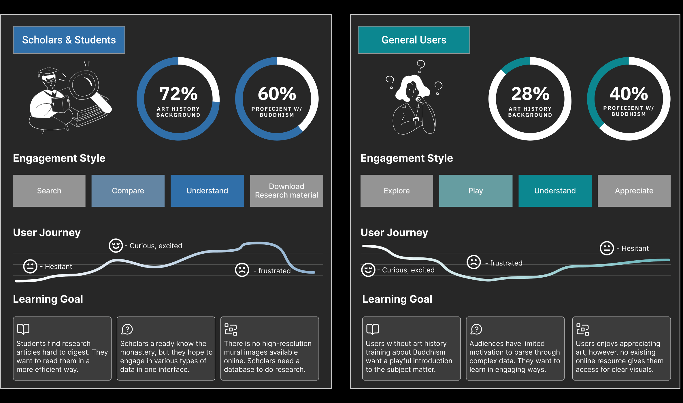
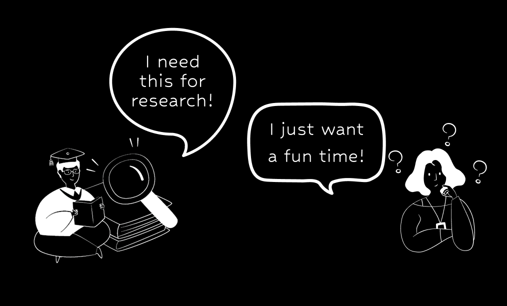
From this, two main user groups emerged: scholars and general audiences. The challenge became: how might we preserve rigor for scholars without overwhelming broader audiences?
Problem & Opportunity
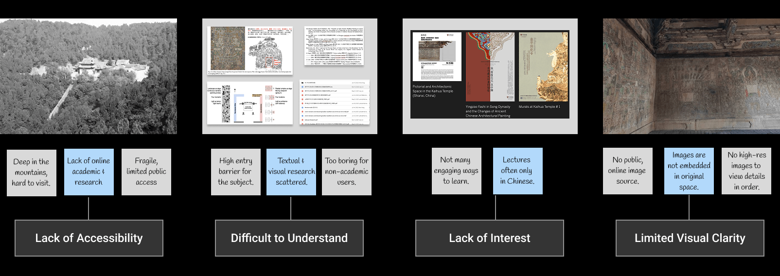
Narrowing our scope, we identified four key opportunity spaces that addresses the painpoints from both user groups.
Setting Up the System
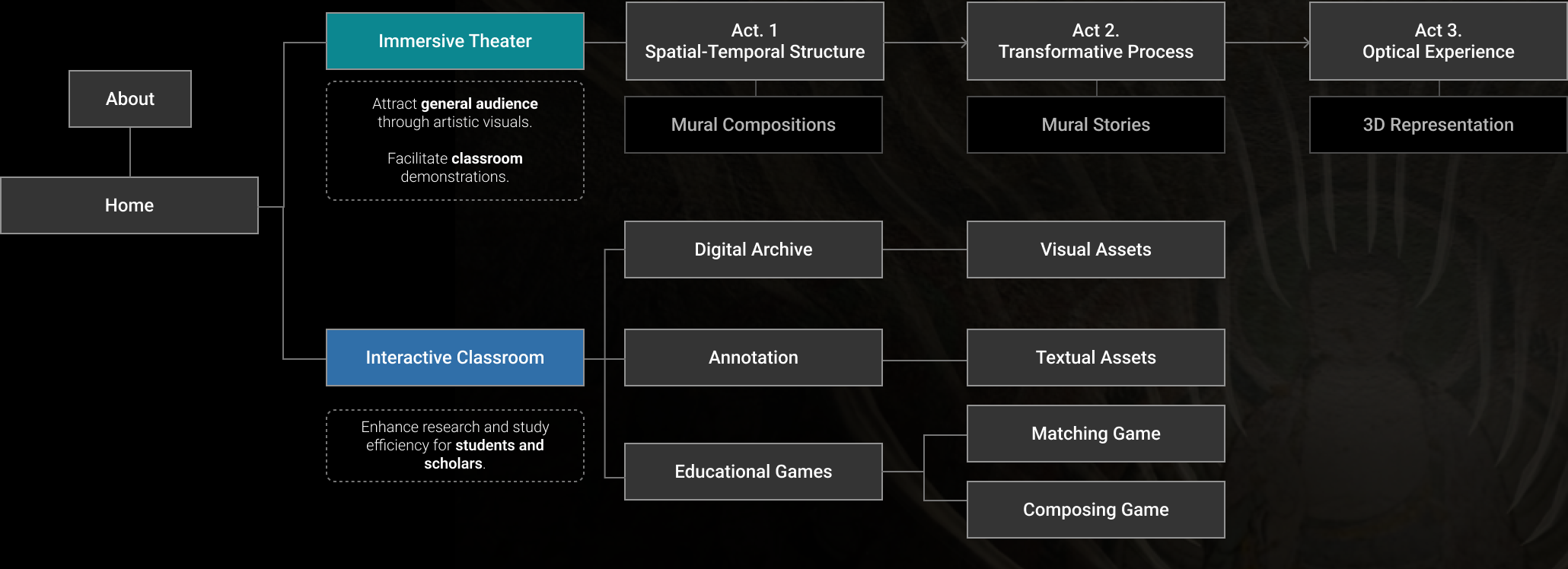
Information Architecture: we crafted two flows for the two types of uers we have.
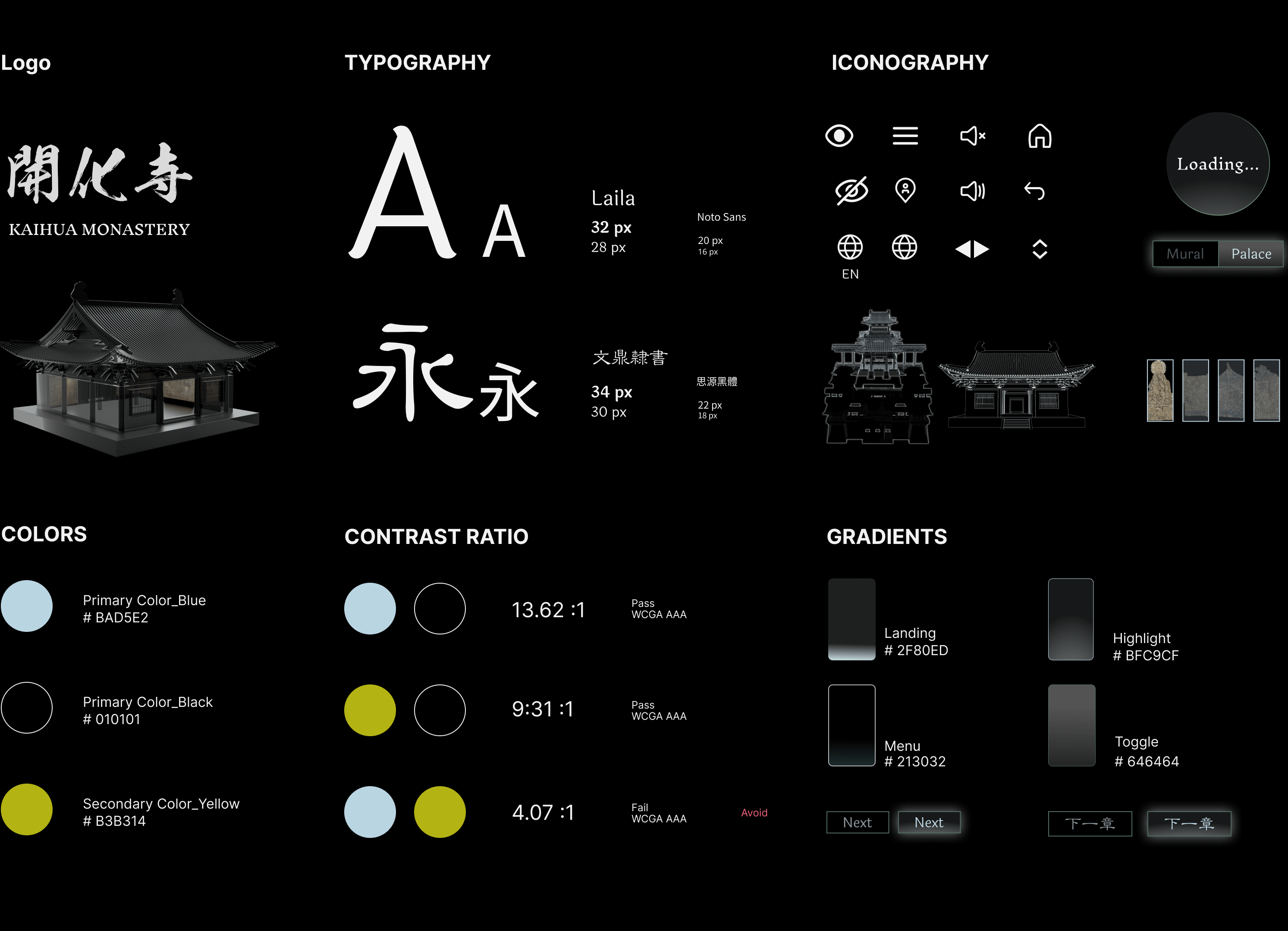
Design System: typography, colors, and components
Usability Testing
To test the early models, we ran 5 rounds of interviews with 40 participants. It led to some key design changes.
I. Spatial & Narrative Clarity
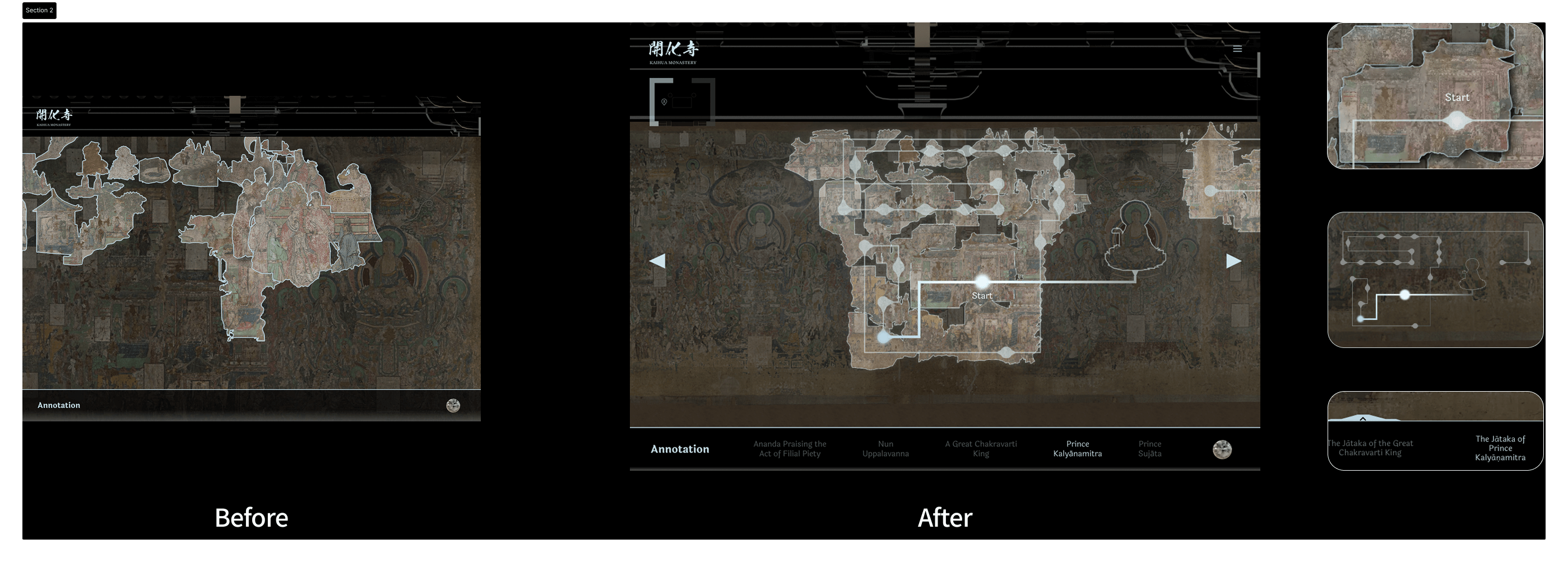
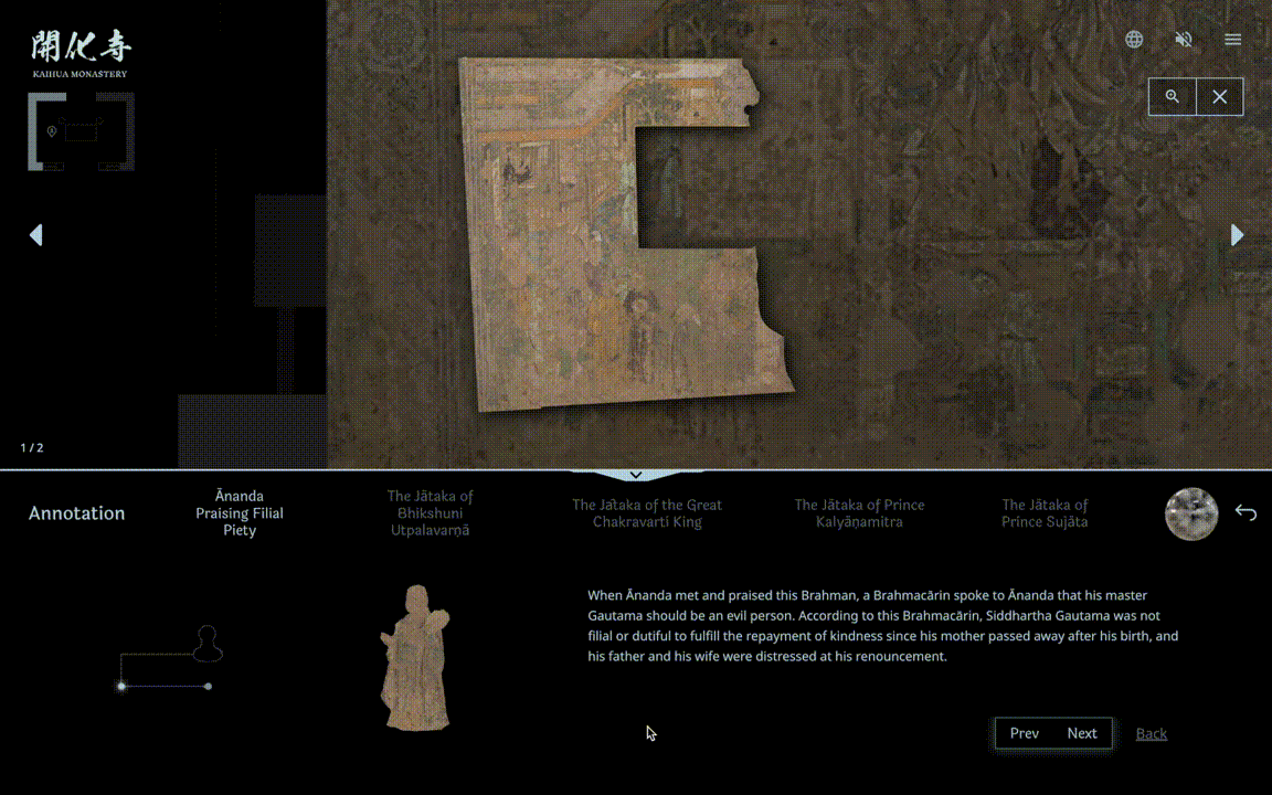
We added UI guidance and guardrails to the annotation process—clarifying where flows begin, how they move, and how narrative threads connect.
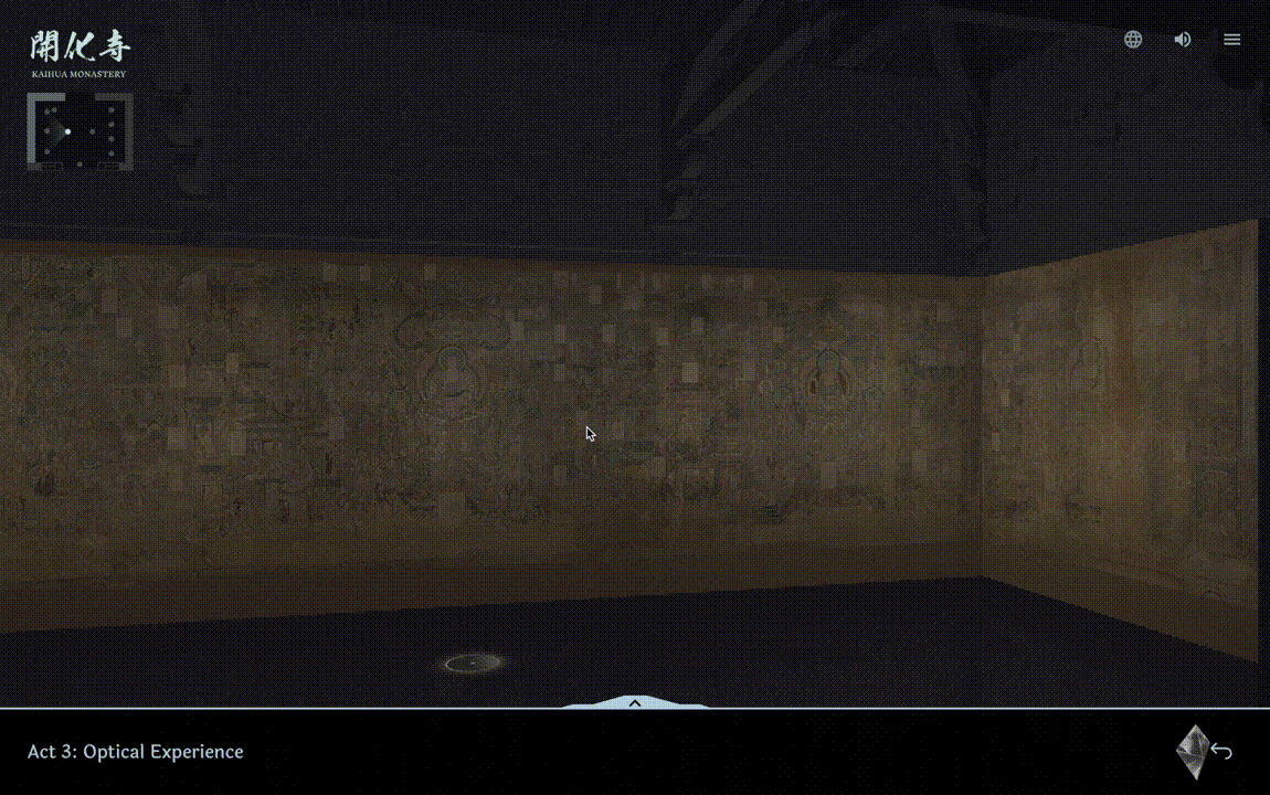
II. Wayfinding in 3D
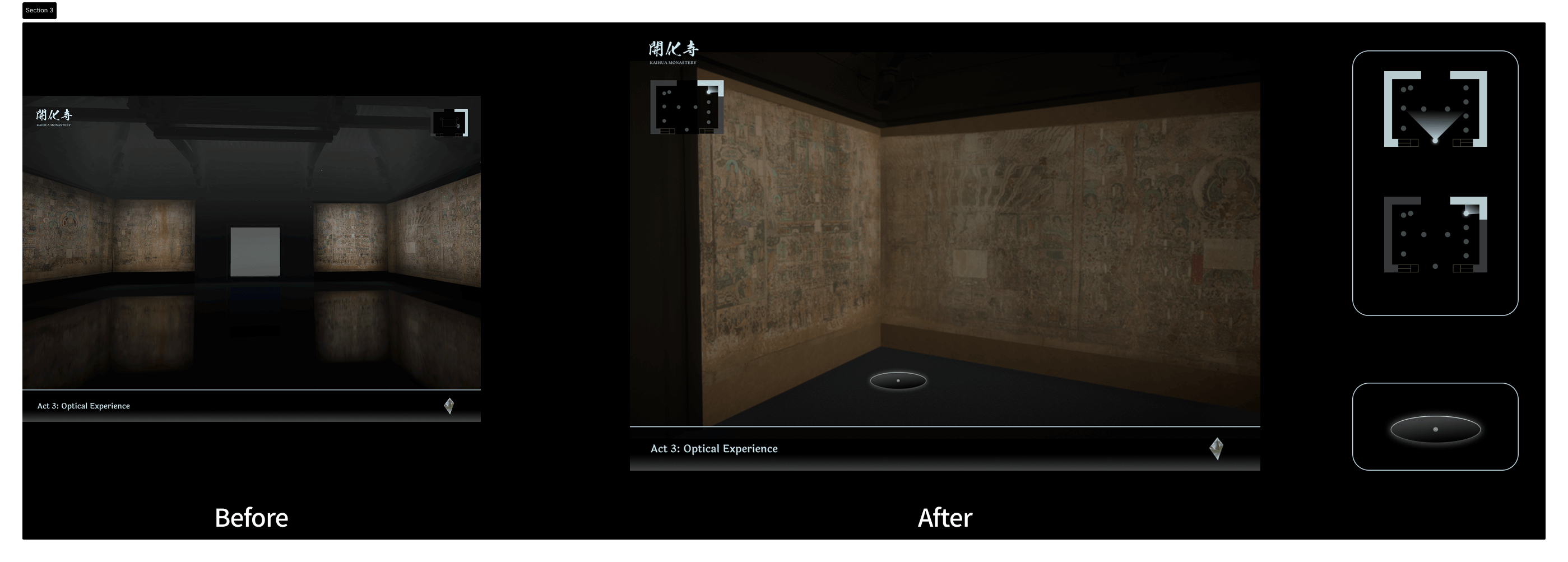
We improved accessibility by addressing slow-network issues (when 3D models fail to load), added wayfinding tools to help users orient themselves, and introduced more intuitive interactions.
Design Solutions
I. Spatial and Informational All-in-One Interface
Researchers no longer need to jump between platforms to access different data. We consolidated research, spatial information, and multimedia into one interface.
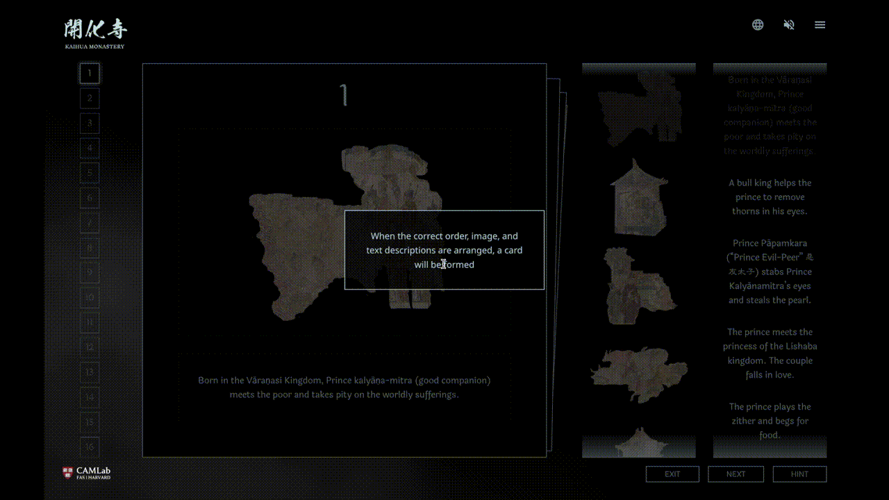
II. The Best Way to Learn
We broke down complex mural narratives into smaller modules and learning games. Testing showed students gained better understanding of the storyline and performed better on image–text matching tests.
III. Designed for Scholarship and Beyond
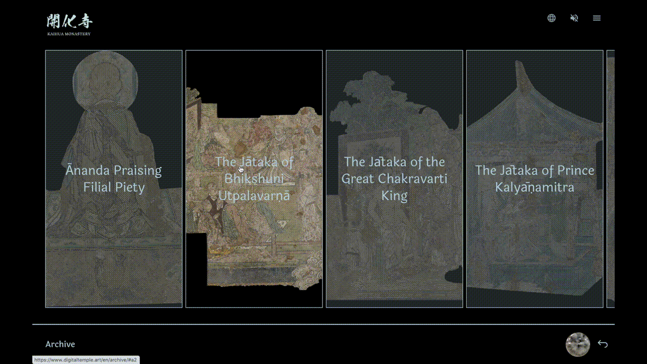
We created a consolidated archive of high-resolution mural snippets, categorized and labeled so scholars and students can easily cite specific scenes and reference them in their research.
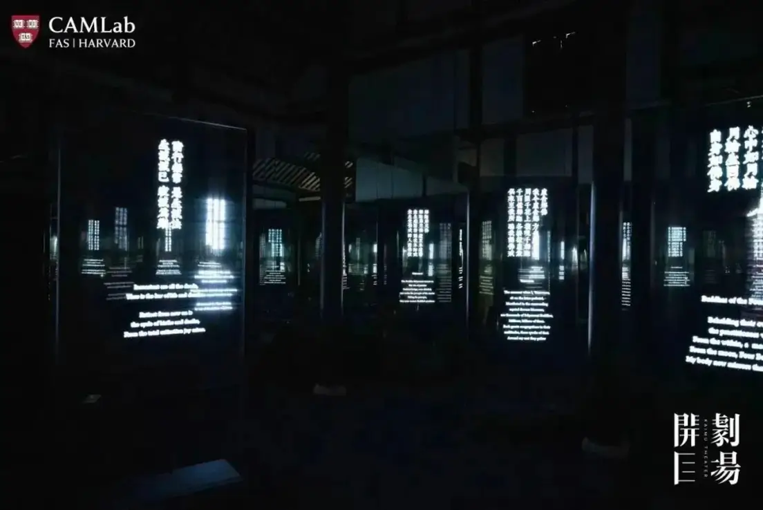
Museum Exhibitions & VR
Alongside the digital platform, we curated physical exhibitions at Harvard and museums across Asia, featuring art installations, immersive theater, and academic events.
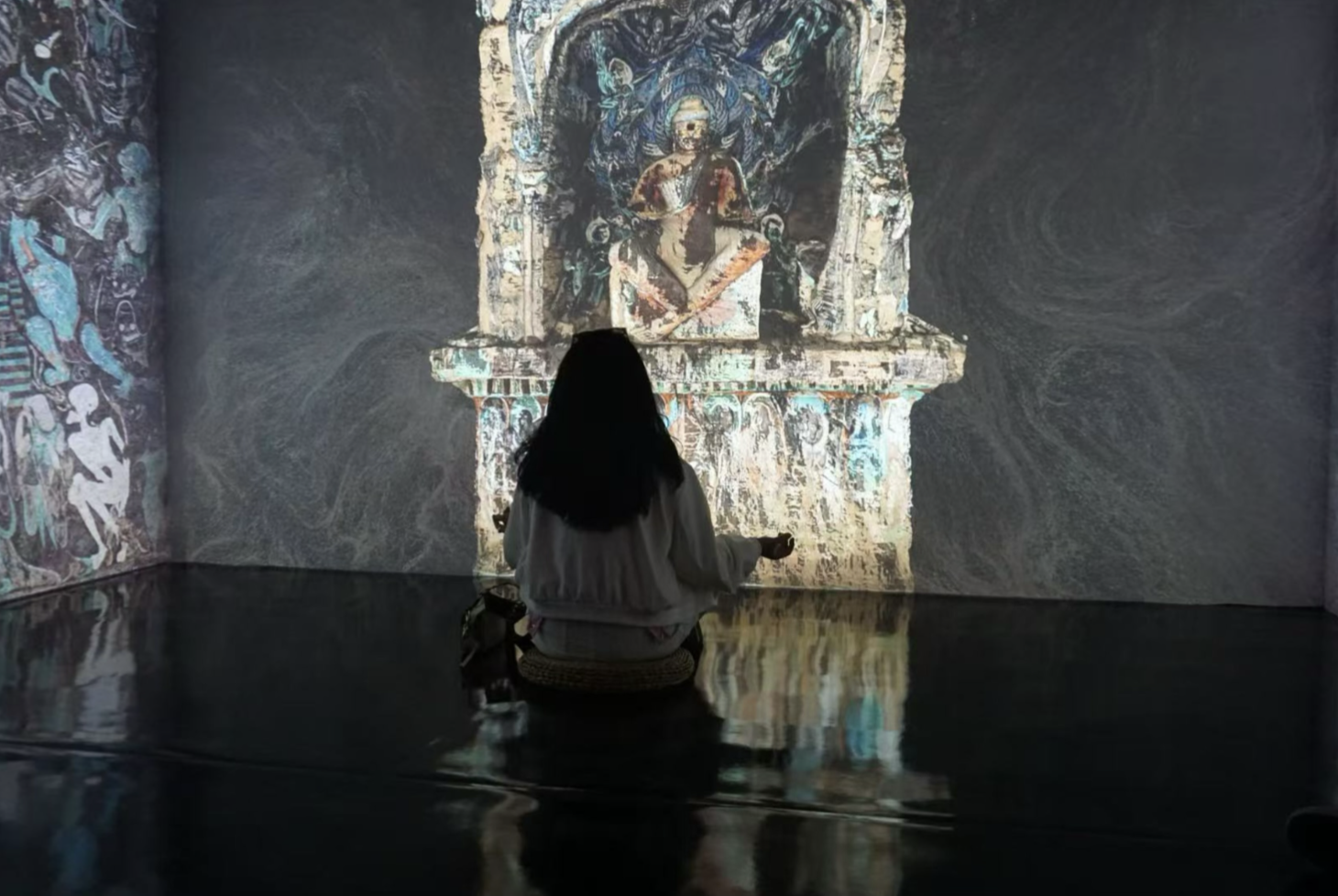
We also created a complementary VR experience, allowing users to explore the temple in 360° on tablets or through VR headsets.
Impact
1.1 M
1535
4+
After launch, user interviews showed that 90% of participants gained new knowledge about Buddhist art through Digital Temple.
On Instagram, the project reached 1M+ views, earned 1,500+ comments, and led to collaboration inquiries from 4+ research institutions and art organizations.
Engagement continues to grow steadily.